JNA Rebrand
JNA Rebrand
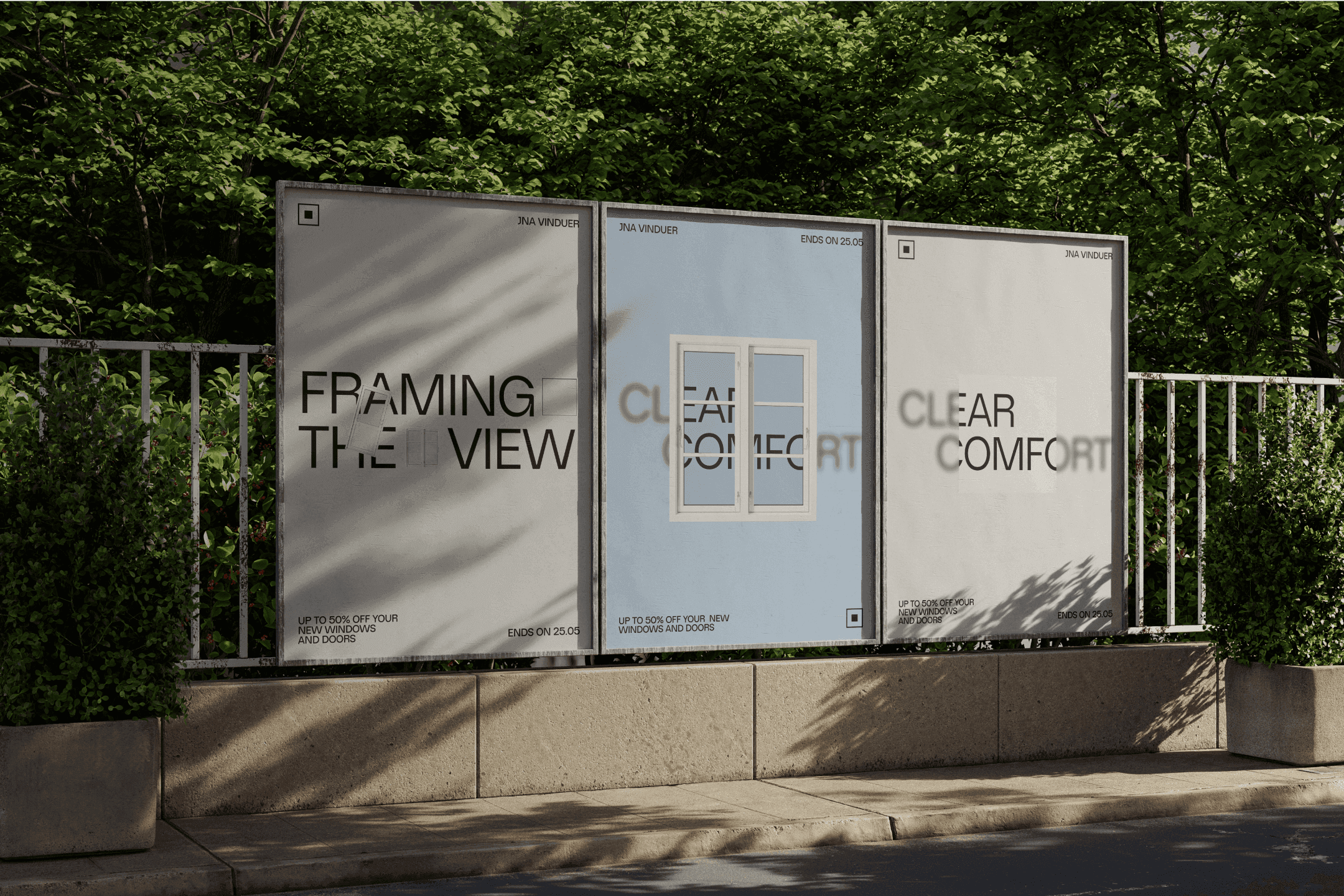
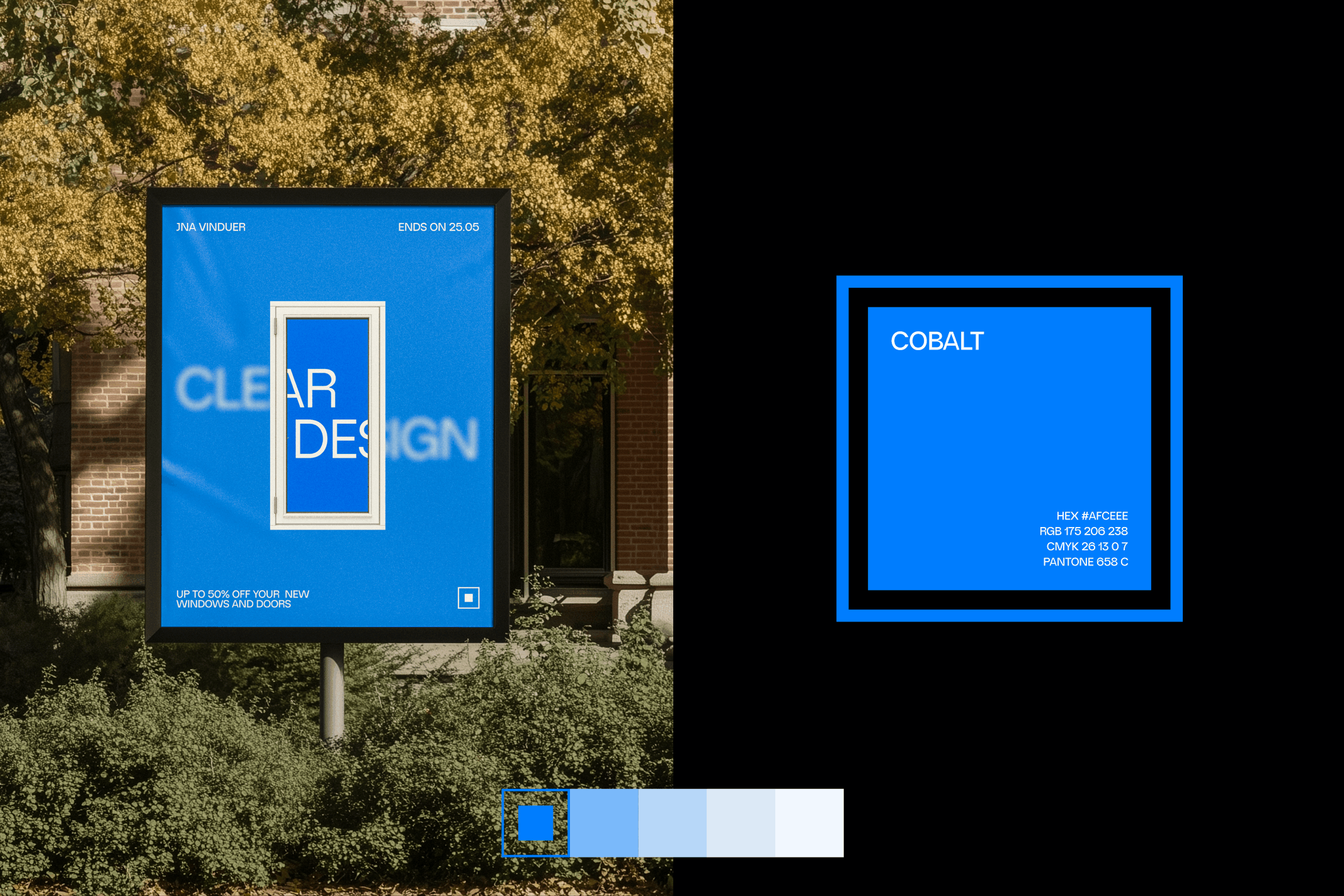
This design project aims to rebuild the JNA brand through a modern lens, using a refreshed color palette that subtly references glass, sky, and the materials of windows and doors.
Branding & Motion
Branding & Motion
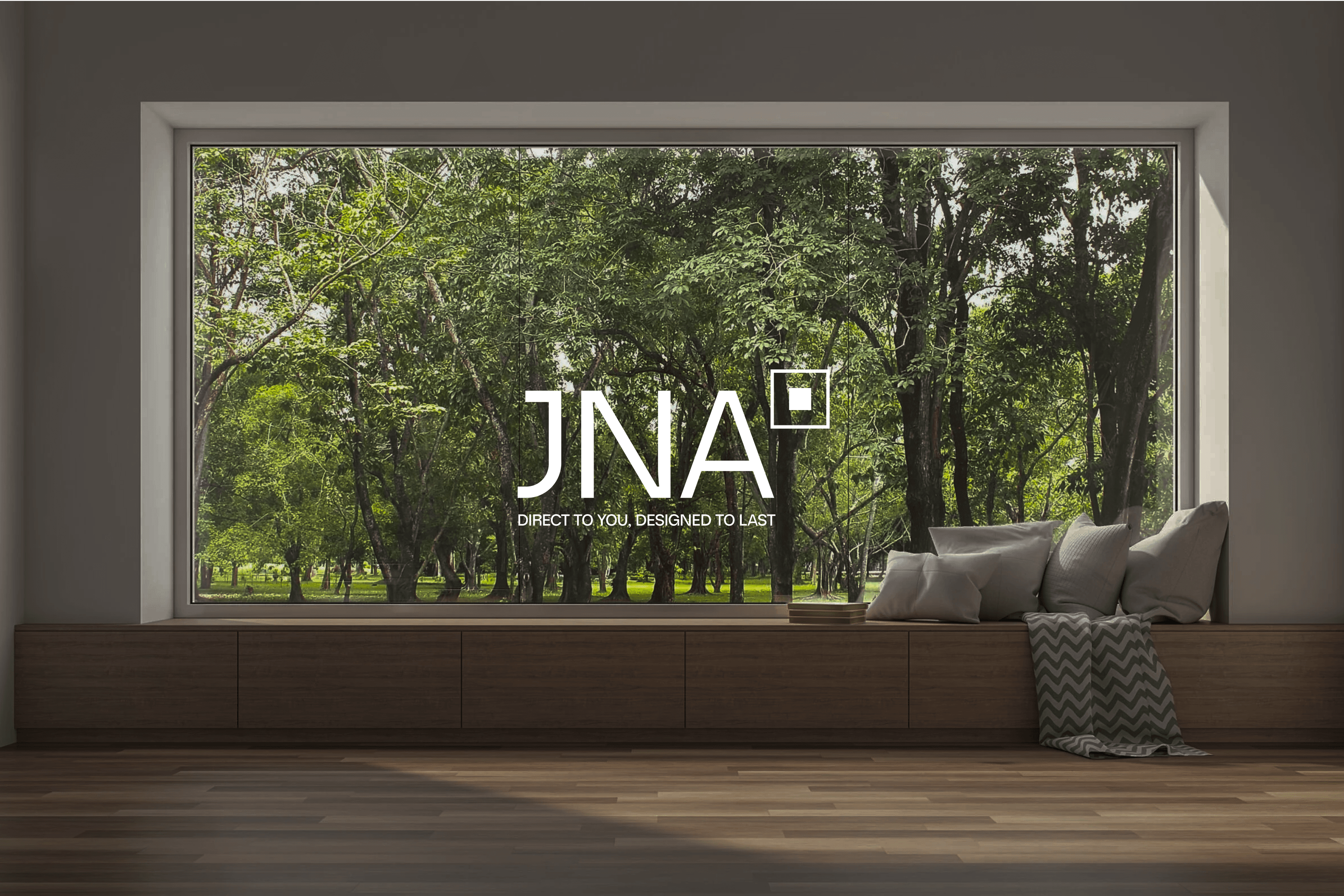
JNA is a Danish online windows and doors company, now reimagined through a modern lens with a focus on precision, clarity, and material-inspired subtlety.
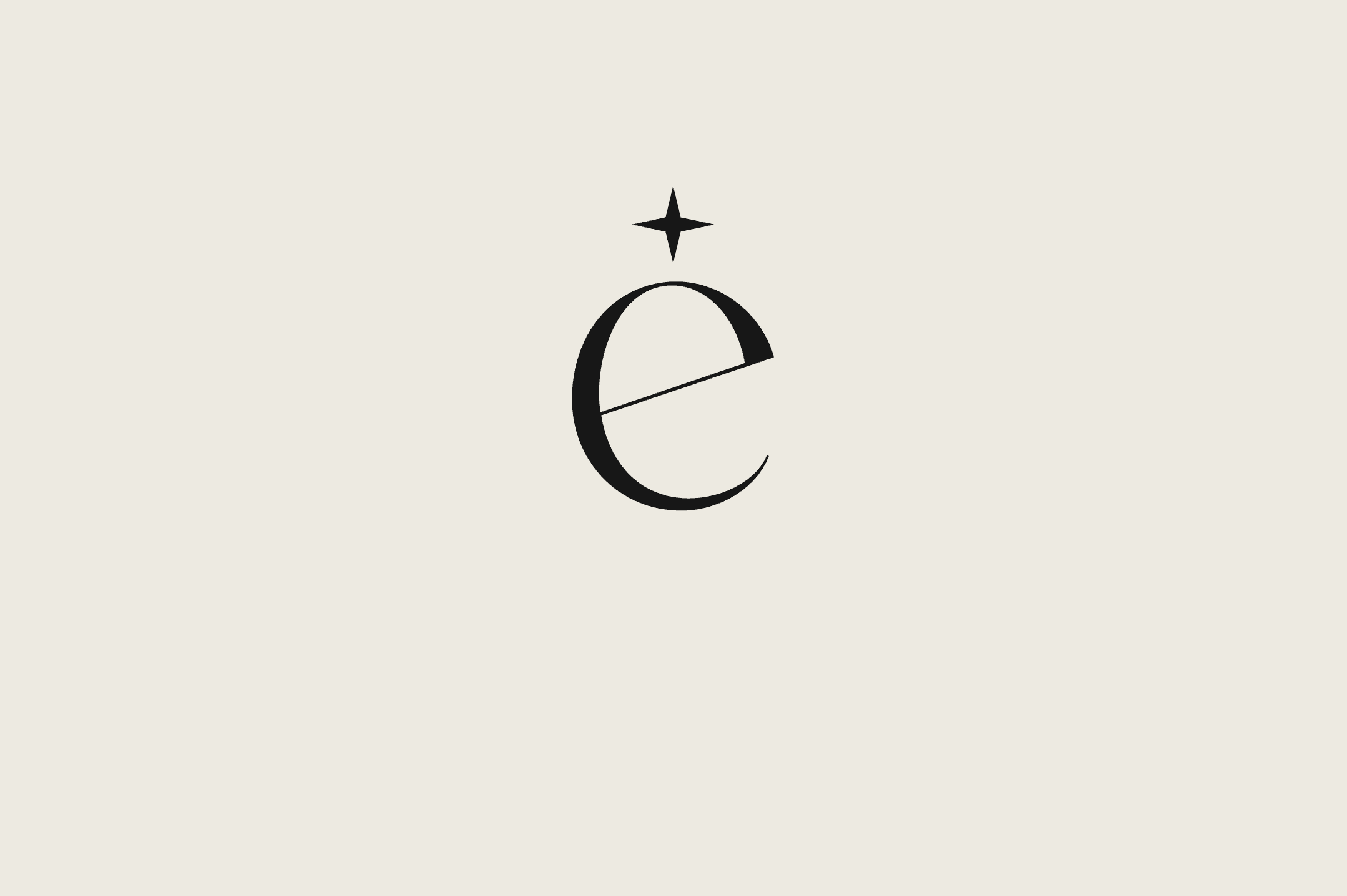
The rebrand introduces a bespoke monogram, and a suite of visual assets that reflect bring this brand back into the modern age.
JNA is a Danish online windows and doors company, now reimagined through a modern lens with a focus on precision, clarity, and material-inspired subtlety.
The rebrand introduces a bespoke monogram, and a suite of visual assets that reflect bring this brand back into the modern age.
Branding & Motion
JNA is a Danish online windows and doors company, now reimagined through a modern lens with a focus on precision, clarity, and material-inspired subtlety.
The rebrand introduces a bespoke monogram, and a suite of visual assets that reflect bring this brand back into the modern age.
Motion Design
Motion Design
For the motion design, I wanted to have the animations mimics the gestures of opening, sliding, and revealing—subtle movements that echo the product experience itself.
For the motion design, I wanted to have the animations mimics the gestures of opening, sliding, and revealing—subtle movements that echo the product experience itself.
Motion Design
For the motion design, I wanted to have the animations mimics the gestures of opening, sliding, and revealing—subtle movements that echo the product experience itself.


More Works More Works
More Works More Works