efémera Candles
efémera Candles
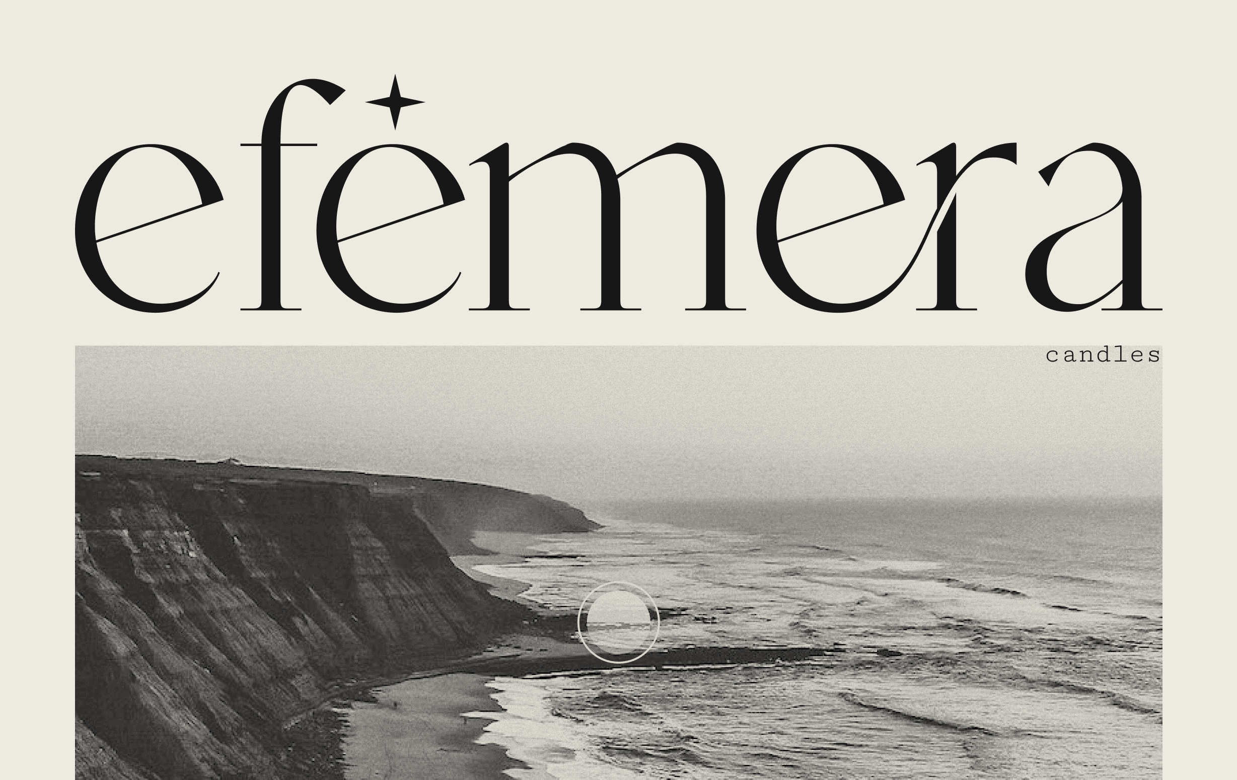
efêmera is an artisanal candle brand inspired by the captivating scents of Portugal. With a commitment to sustainability and using locally sourced ingredients, efêmera candles are meticulously handcrafted to transport you to the streets, beaches, forests, fields, and all the other amazing places that are a part of this beautiful country.

Branding & Candle-Making
Branding & Candle-Making
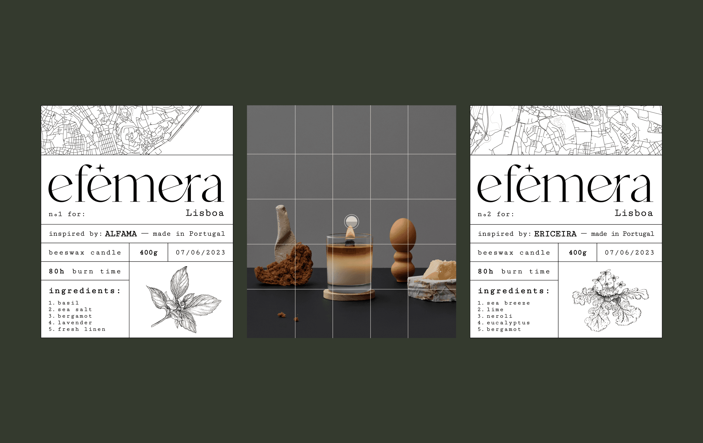
For this brand, I tried to encapsulate an apothecary meets old-timey newspaper vibe with a touch of Lisbon's very palpable atmosphere. Using a monotype font for the main text coupled with a pretty intricate serif font for the logo allowed me to explore this monochromatic aesthetic that I believe fits very well with the purpose of this brand and its environment.
For this brand, I tried to encapsulate an apothecary meets old-timey newspaper vibe with a touch of Lisbon's very palpable atmosphere. Using a monotype font for the main text coupled with a pretty intricate serif font for the logo allowed me to explore this monochromatic aesthetic that I believe fits very well with the purpose of this brand and its environment.
Branding & Candle-Making
For this brand, I tried to encapsulate an apothecary meets old-timey newspaper vibe with a touch of Lisbon's very palpable atmosphere. Using a monotype font for the main text coupled with a pretty intricate serif font for the logo allowed me to explore this monochromatic aesthetic that I believe fits very well with the purpose of this brand and its environment.
Colors
Colors
I chose a monochromatic color palette because I want the focus of each candle to be on their smell. The only visually distinguishing elements on the labels are the maps that represent the place that the candle embodies, and an illustration of the main note of the candle.
I chose a monochromatic color palette because I want the focus of each candle to be on their smell. The only visually distinguishing elements on the labels are the maps that represent the place that the candle embodies, and an illustration of the main note of the candle.
Colors
I chose a monochromatic color palette because I want the focus of each candle to be on their smell. The only visually distinguishing elements on the labels are the maps that represent the place that the candle embodies, and an illustration of the main note of the candle.


More Works More Works
More Works More Works